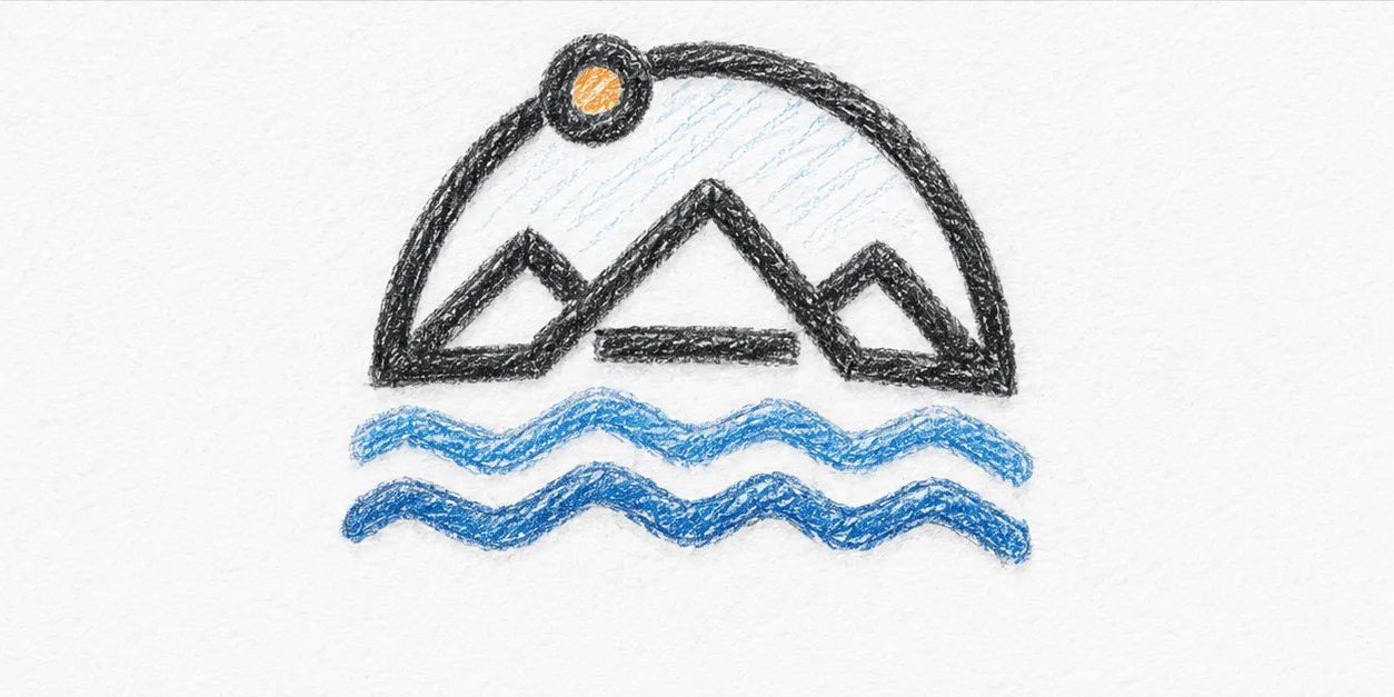
Most people who've heard how a Travaholic patch gets made know the first step: charcoal, paper, a real place. Fewer know the middle step, the one that actually takes the longest — a coloured-pencil pass, done after the digital render, that exists purely to test whether a colour combination survives being looked at slowly.
It sounds redundant. It isn't. A digital mockup can lie — screens render colour with a confidence thread never has. Coloured pencil is slower and more honest; you can see exactly where a shade is doing too much work, where a line is thinner than the embroidery machine will actually manage, where two colours that looked fine on-screen are fighting each other on paper.
The line-art version — no colour, just the shapes — is the real test. If a patch still reads clearly in pure black outline, the design underneath is solid. If it needs colour to make sense, it needs more work.
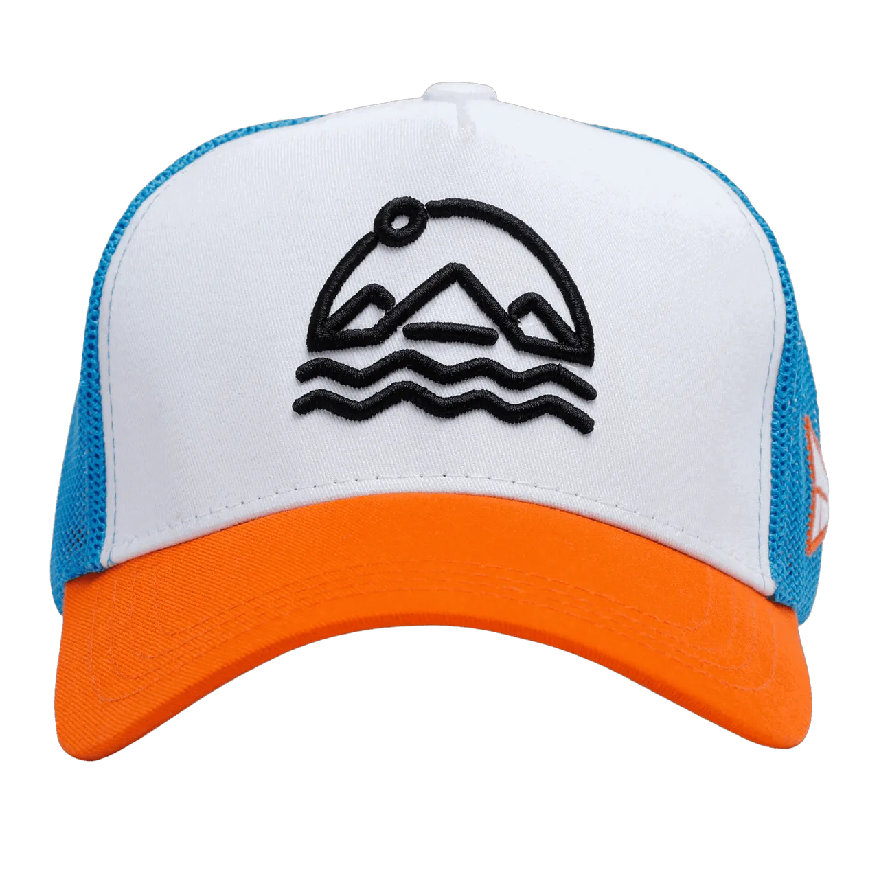
Travaholic Orange exists almost entirely as that line-art test, kept deliberately uncoloured — a mountain, a sun, a wave, stitched straight onto the panel with no patch material at all. It's the one Chapter where the middle step became the whole point instead of a checkpoint on the way to something busier.
None of this is visible in the final product photo, and that's sort of the idea. A cap either feels considered or it doesn't, and most of what makes it feel that way happened in a sketchbook weeks before a single thread got involved.